See what your watchlist is actually doing, before you bet on it.
HackTrader plots a focus ticker at the center of a correlation radar and its peers on rings whose radius tracks live correlation strength. Levels, channels, and volume context fill in the rest of the structural picture — so a basket's alignment around an idea is something you can see at a glance, not read out of a table.
Two minutes with the radar.
Watch a quick walkthrough of HackTrader's correlation radar, levels, and channel bands — from sign-in to structural read.
Four lenses on the same tape.
Each view describes what is currently visible in price, level, and correlation data. None of them try to predict what is about to happen — that part is still your job.
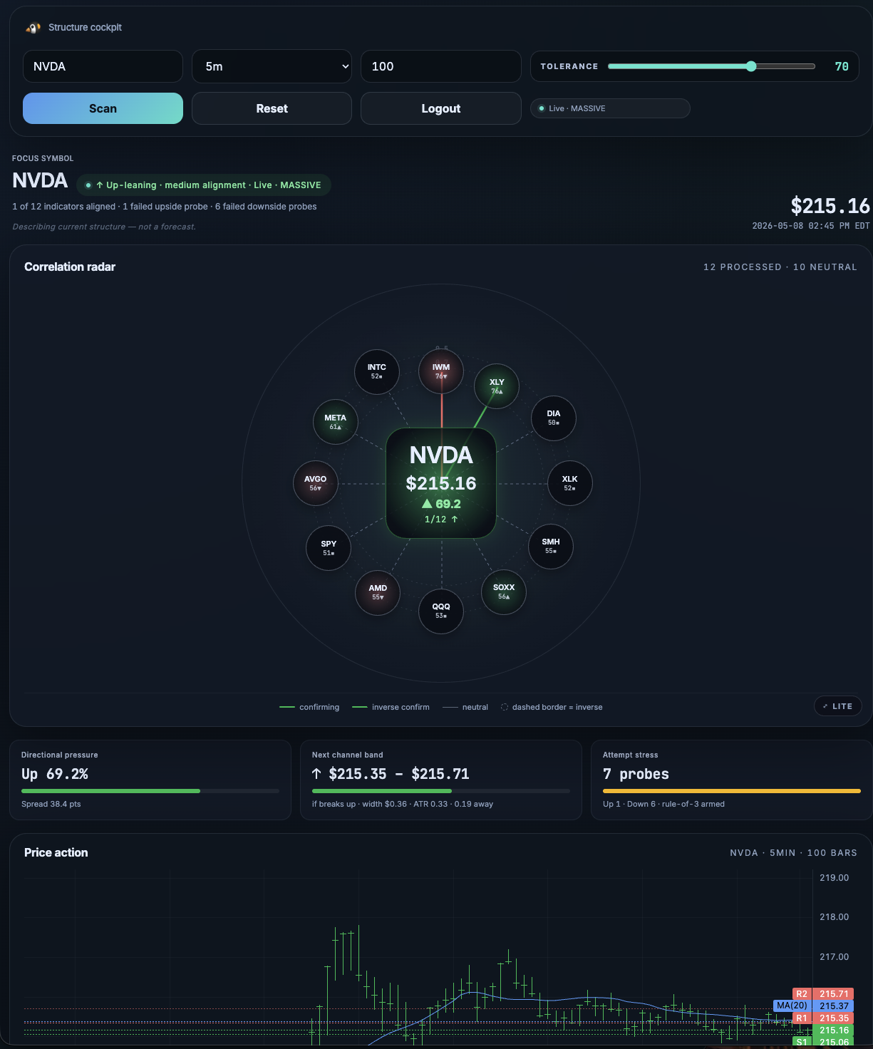
The basket, at a glance.
Focus ticker at center. Peers orbit at a radius proportional to live rolling correlation. When the basket tightens around an idea you see the rings close in; when conviction breaks you see them scatter. No table-reading required.
Levels the tape keeps respecting.
Ladders drawn from prior pivots and high-touch zones. Not magical Fibonacci paint — just the lines price has actually rejected from over the lookback window you've chosen.
Where price is "in range" and where it isn't.
Linear regression channels at one and two standard deviations around the trend, so you can see at a glance whether the current print is mid-channel, riding a band, or breaking out altogether.
Is the move on conviction or just drift?
Per-bar volume against the rolling average, color-coded by relative magnitude. A breakout on heavy volume looks visibly different from a quiet test of the same level.
It's a visualization tool. Not a signal service.
Half the products in this space sell you arrows on a chart and a Discord ping at 4am. HackTrader doesn't. It shows you what's currently in the data so you can make a better call — the call itself is yours to make.
Start free. Pay when the watchlist outgrows it.
Every tier gets the full visualization stack. Paid tiers raise the ticker and API quotas; the live-data tiers unlock real-time feed when they ship.
Enough to track one idea.
- 5 focus tickers
- 1,000 API calls / month
- Full correlation radar
- Levels & channels
- 15-min delayed feed
Cover a full watchlist.
- 25 focus tickers
- 25,000 API calls / month
- Everything in Free
- Email support
- 15-min delayed feed
Cover a full watchlist with live data.
- 25 focus tickers
- 25,000 API calls / month
- Everything in Starter
- Real-time market feed
- Email support
Run the whole tape.
- Unlimited focus tickers
- Unlimited API calls
- Everything in Plus
- Multi-window dashboard
- Priority support
The questions everyone asks first.
Is HackTrader telling me what to trade?
What's the data feed?
Can I cancel anytime?
Do I need to install anything?
What does "correlation strength" actually measure?
Who's behind HackTrader?
Stop reading correlation tables. Start seeing them.
Free tier gives you the full visualization stack on five tickers. Sign in with Google and you're charting in under a minute.